Barclays
Redesigning the Barclays apprentice onboarding experience through Design Thinking.
A research-driven internal tool focused on automation, clarity, and user empowerment.
Timeline
8 weeks
Tools Used
Figma, Teams, FigJam, LUMA Institute Methods, RICE Framework
Team Project
The Ask:
Barclays is committed to expanding early career opportunities, especially in technology. However, the existing onboarding process for apprentices was fragmented, confusing for new starters, and inefficient for managers. The ask was to design an internal onboarding web app that centralised training materials, automated role setup, and improved the onboarding experience for both apprentices and management.
The Solution:
The result was the Pathways Onboarding App, a user-centred platform designed to streamline the apprentice onboarding process at Barclays. The app enables:
Apprentices to access all training materials in one hub
Managers to automate requests for roles and permissions
Teams to track progress, set objectives, and collaborate more effectively
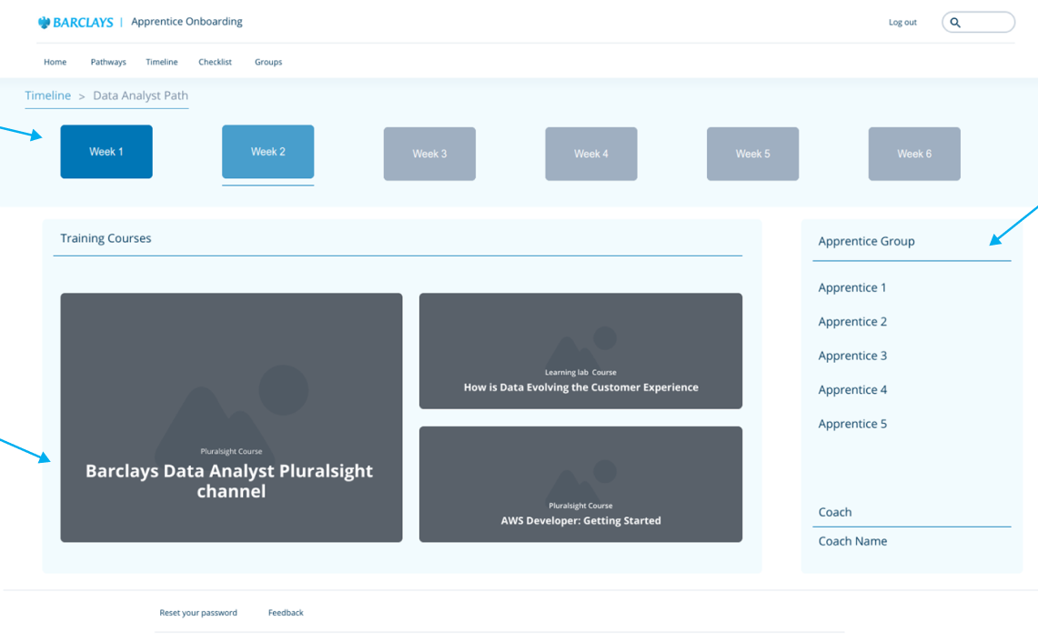
Key features include a training hub, team status tracker, task timeline, and a ‘basket’ system for managing requests, all guided by input from apprentices and managers throughout the design process.
DESIGN PROCESS
Empathise
Heuristic evaluation
Interviews
Rose, Thorn, Bud
cognitive mapping
Define
Ideate
Design
Test
Usability interviews
Feedback synthesis
How Might We
User journey map
Problem statements
Personas
Brainstorming
RICE model
Impact/Effort matrix
Wireframes
Interactive Figma prototype
CASE STUDY
This project highlights how a research-led UX approach can create meaningful internal tools. By applying the Design Thinking process, I was able to turn a vague business need into a focused, user-driven solution. The final designs address both apprentice and management needs, and was ready to move into MVP development. The project emphasised the value of continuous feedback, prioritisation frameworks, and designing for real-world feasibility in enterprise environments.
Empathise
The process began with understanding the behaviours, frustrations, and expectations of two primary user groups: apprentices and onboarding managers. I conducted interviews, heuristic reviews, and a cognitive mapping exercise to uncover pain points. To synthesise qualitative insights, I applied the Rose, Thorn, Bud method, identifying moments of opportunity, frustration, and existing strengths.
This stage revealed that apprentices lacked a clear, unified space for training and goals, while managers were burdened by manual, repetitive processes when setting up new hires.
Define
With research insights in hand, I reframed the problem using Point-of-View (POV) statements and How Might We (HMW) prompts. I developed lightweight personas to reflect typical users, an apprentice navigating training materials, and a manager setting up multiple apprentices simultaneously.
Defining the core challenges made it clear the solution needed to be more than just a content portal, it had to centralise resources, automate requests, and visualise progress for all parties involved.
Ideate
Using the HMW statements as prompts, I brainstormed a wide range of potential features. To avoid scope creep and focus on the highest-value ideas, I applied the RICE scoring model and mapped concepts using an Effort/Impact matrix (LUMA method).
This helped identify features that were not only feasible but also highly impactful:
A training hub for apprentices
A task timeline showing progress and deadlines
A basket-style request system for managers
A status dashboard for team collaboration
Prototype
I translated the prioritised features into low- and mid-fidelity wireframes to test structure, flow, and basic functionality. Feedback from an initial focus group led to new features, such as a request summary basket, being added to improve manager workflows. Apprentices also highlighted the need for clearly grouped training modules, leading to the integration of content categories by team, role, and business area.
Each screen was designed to be simple, accessible, and aligned with the Barclays internal ecosystem, using scalable components and minimal friction.
Test
Once the high-fidelity wireframes were complete, I ran a second round of interviews with apprentices and managers to validate improvements. I asked comparable questions to those used during the initial empathy phase to assess whether the key frustrations had been addressed.
Feedback was overwhelmingly positive. Apprentices found the interface clearer and more motivating, and managers reported that automated features and the visual status tools would significantly reduce manual admin tasks.


