HAUS Hotel
A visually engaging and user-friendly website that aligns with the brand personality, a modern, art-focused hotel for solo travellers and digital nomads.

Timeline
10 weeks
Tools Used
Figma, FigJam, Adobe Color, Google Forms, Notion
Solo Project
The Ask:
HAUS is a new hotel brand launching in Glasgow, designed for solo travellers and digital nomads who value creativity, community, and culture. The brief was to design a website that reflects HAUS’s modern, art-focused identity while offering a smooth and inspiring user experience. The core challenge was to differentiate HAUS from local competitors like Citizen M and Revolver by highlighting its social spaces, cultural integration, and stylish functionality, all within an engaging, mobile-first interface.
I was responsible for shaping the brand’s visual identity online, defining user flows, and designing a responsive prototype that balances bold aesthetics with usability.
The Solution:
I followed a full UX lifecycle, from research to high-fidelity prototyping, grounded in competitive analysis, travel trend insights, and user-centred design principles. I began by evaluating the visual and functional strengths of competitors, identifying gaps in local relevance, consistency, and accessibility. This informed the development of two personas: Alex, a digital nomad seeking productivity and connection, and Emily, a culturally curious explorer.
Through mood boards and style tiles, I crafted a distinct visual identity combining bold reds, calming blues, and modern, rounded typography to reflect HAUS’s creative, welcoming atmosphere. Early ideation through Crazy 8s and sketching explored layout concepts that balanced vibrant visuals with clarity and functionality. These sketches evolved into low-fidelity wireframes and eventually a detailed, responsive high-fidelity prototype built in Figma.
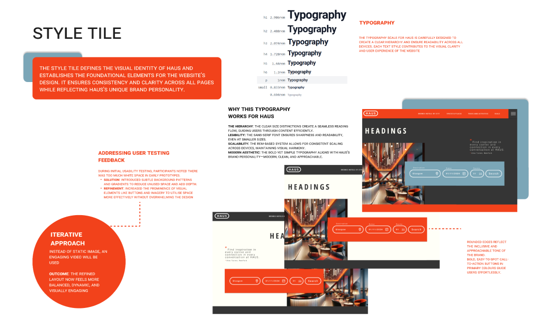
Key features included a “Spaces & Places” section to highlight co-working and communal areas, a dynamic tour booking experience promoting local art and culture, and a seamless room booking system designed for mobile. Usability feedback prompted refinements such as reducing white space, increasing button prominence, and enhancing content hierarchy.
The final prototype delivers a warm, accessible, and distinctly Glaswegian experience that invites users to explore, connect, and book with confidence.
DESIGN PROCESS
Research & Discovery
Travel trend summary
Competitor UX/UI matrix
Gap analysis report
Audience Definition
User goals and pain points
Persona profiles
Experience journey maps
Visual Identity Exploration
Mood boards
Style tile
Colour palette and brand rationale
Ideation & Sketching
Crazy 8’s
Brainstorming
Sketches
Prototyping & Iteration
Wireframe set
Flow diagram
High-fidelity prototype
UI component library
CASE STUDY
Overview
HAUS is a new boutique hotel concept launching in Glasgow, aimed at solo travellers and digital nomads looking for creativity, comfort, and cultural connection. The brief was to design a brand-aligned, user-focused hotel website that would position HAUS as a fresh alternative to conventional city accommodation. My challenge was to translate the brand’s bold, artistic vision into a seamless and inviting digital experience.
Approach
I led a full UX process from research to prototyping. After analysing travel trends and user needs, I defined two core personas that guided design decisions: Alex, a digital nomad seeking co-working and quick booking, and Emily, a solo traveller wanting cultural immersion. Using mood boards, style tiles, and early sketching, I shaped a visual identity built on bold reds, soft neutrals, and playful, modern UI elements.
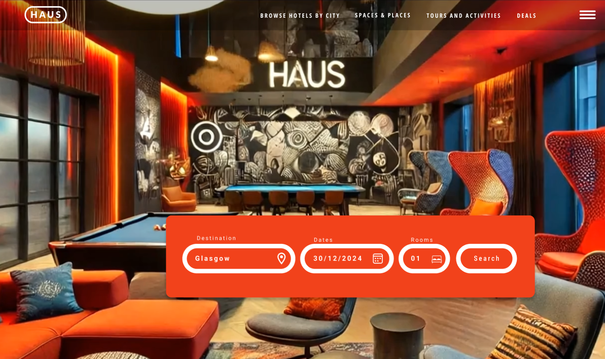
The prototype brought the brand to life with high-quality imagery, interactive room cards, and a refined booking flow. A “Spaces & Places” section highlights communal areas, while a dynamic “Tours & Activities” page invites exploration of Glasgow’s art and culture scene. I refined the interface through user feedback, addressing concerns around spacing, button visibility, and flow clarity.
Research & Brand Discovery
To begin, I immersed myself in the HAUS brand’s values, creative, social, and modern. I researched solo travel trends, identifying that the 25–34 age group dominates this sector, with digital nomads and culturally curious travellers valuing both privacy and connection.
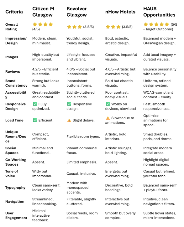
I conducted a competitor analysis of Citizen M, Revolver, and nHow Hotels to understand what works and where they fall short. I discovered opportunities to differentiate HAUS through local cultural integration, consistent UI, and bolder yet more welcoming visuals.
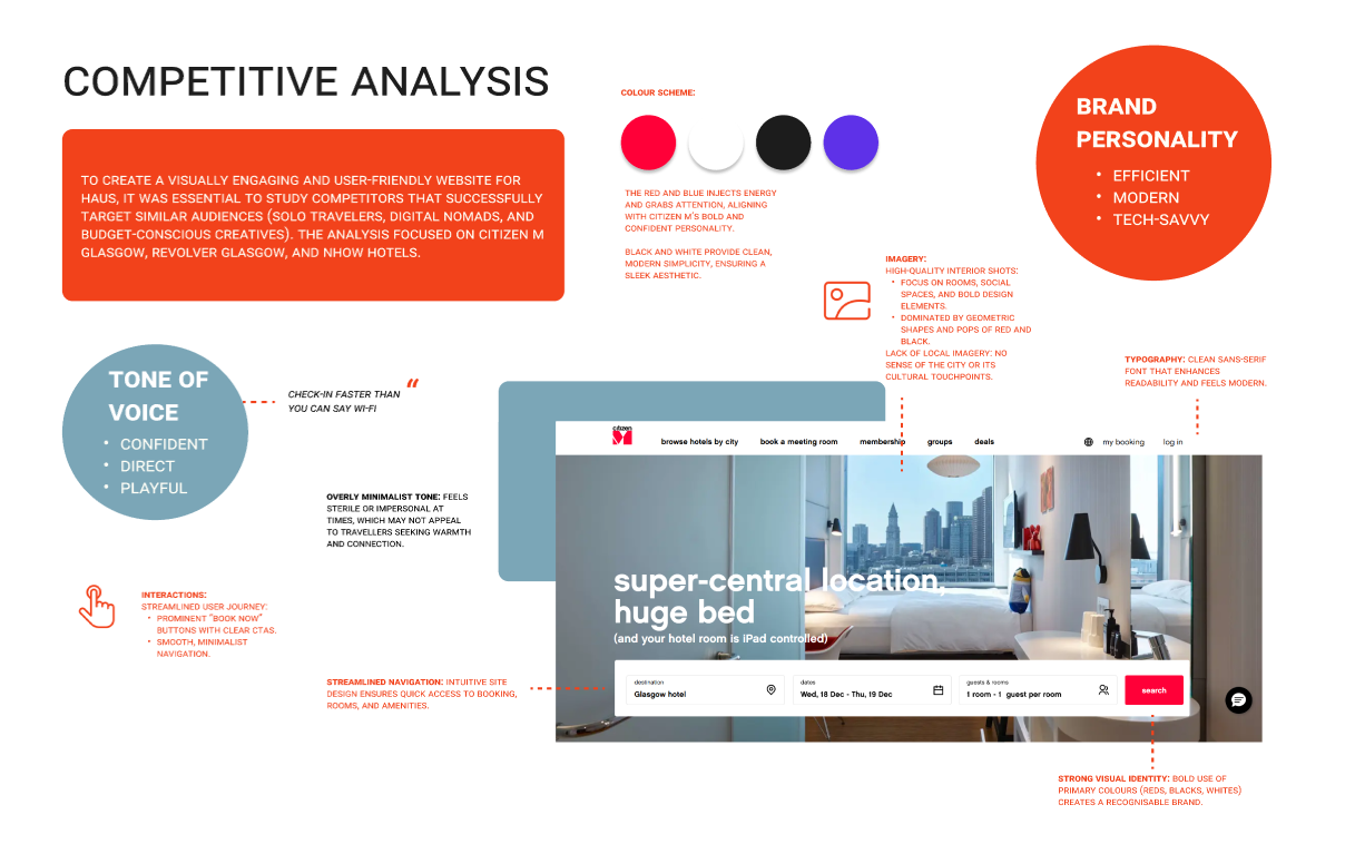
To identify where HAUS could differentiate itself in a competitive Glasgow market, I performed a gap analysis comparing three key competitors: Citizen M Glasgow, Revolver Glasgow, and nHow Hotels.
This analysis focused on several UX and brand dimensions including:
Visual identity and consistency
Navigation and booking flow
Integration of local culture
Use of imagery, typography, and tone of voice
Accessibility and mobile performance
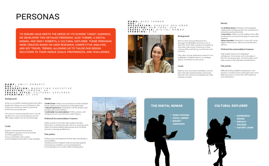
Persona Development
Using insights from trend research and competitive review, I created two personas to represent HAUS's primary audience:
A digital nomad: needs quiet spaces, fast booking, and social co-working.
A cultural explorer: seeks inspiring interiors, local art, and curated tours.
These personas grounded all design decisions, helping me prioritise emotional connection and cultural relevance alongside functionality.
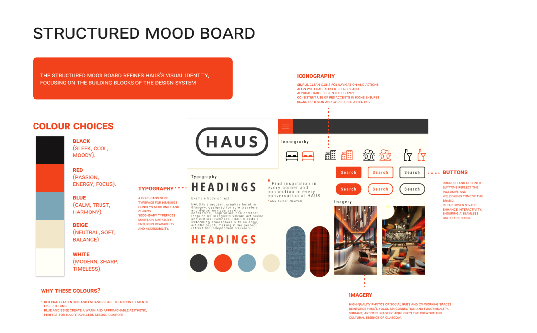
Visual Exploration & Brand Identity
To define HAUS’s visual language, I developed both unstructured and structured mood boards. I drew on Glasgow’s murals, sculptures, and creative scene, blending them with clean, modern elements to reflect HAUS's artistic but welcoming identity.
The final style tile established:
A bold colour palette (red, blue, beige, white, black)
Clean sans-serif typography with rounded accents
Soft, tactile buttons and high-quality imagery
A casual, confident, social tone of voice
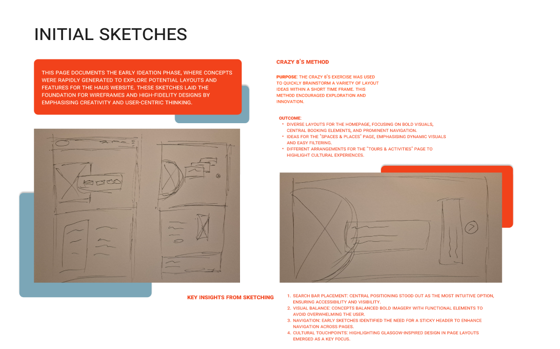
Ideation & Sketching
Using the Crazy 8s method, I quickly explored layout options for key screens, including the homepage, booking flow, and "Spaces & Places" pages. Key decisions emerged here, such as:
Central search bar placement
Sticky nav and hero CTAs
Visual balance between photography and booking tools
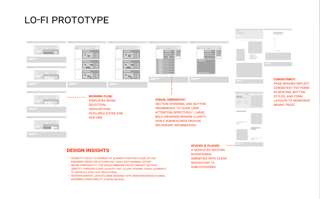
Wireframing
I translated sketches into low-fidelity wireframes to test layout, flow, and interaction. I designed:
A clear homepage grid
A streamlined booking experience
A visual layout for room cards and cultural experiences
Focus was placed on navigation clarity, reducing cognitive load, and ensuring mobile-friendliness from the start.
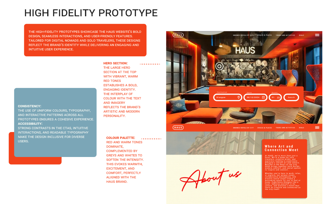
Using Figma, I brought HAUS to life with a bold, elegant interface. Key design features included:
Animated room cards with hover reveals
Tour pages with progressive scroll animations
Sticky “Book Now” CTAs and interactive forms
Typography, icons, and motion effects were kept consistent to build brand trust. Accessibility was also considered through contrast, size, and layout choices.