Mingle
A visually engaging and user-friendly website that aligns with the brand personality, a modern, art-focused hotel for solo travellers and digital nomads.
Timeline
7 weeks
Tools Used
Figma, FigJam, Adobe Color, Google Forms, WebAIM
Solo Project
The Ask:
Glasgow is home to over 185,000 students from around the world, yet many find it difficult to discover social events, cultural experiences, and local spaces that truly reflect student life. The brief was to design a mobile app that connects students to everything Glasgow has to offer, from festivals and hidden gems to student-friendly venues and local gigs, all in a way that’s inclusive, accessible, and tailored to individual needs.
This project, commissioned under the guidance of Glasgow City Council, aimed to enhance student engagement with the city through digital innovation. I was responsible for leading the end-to-end UX design process, from user research and competitor analysis through to prototyping and final design.
The Solution:
The final solution is Mingle, a mobile app designed specifically for students in Glasgow to discover local events, cultural experiences, and social activities with ease. The app combines personalisation, affordability, and accessibility into a single, intuitive platform.
Key features include:
Personalised event discovery based on interests, location, and social activity
Interactive map with filters for event type, budget, and proximity
Social connection tools, such as RSVP with friends and shared event feeds
Bookmarking & favourites for saving events and building a personal itinerary
Accessibility options, including large tap targets, contrast settings, and simplified navigation
Real-time notifications for last-minute events and trending activities
The visual design reflects a youthful, inclusive, and energetic brand, using bold colours, clean typography, and micro-interactions to enhance engagement. The app delivers on its goal to support student life by making it easier to explore Glasgow, connect socially, and feel a sense of belonging in the city.
DESIGN PROCESS
Discover
Surveys & Interviews
Affinity mapping
Empathy mapping
Secondary research
Define
Develop
Deliver
User goals and pain points
Job stories
POV & HMW
Journey maps
Mood boards
Style tile
Site map
Lo-fi wireframes
Crazy 8’s
Testing feedback
UI kit
Style tile
High-fi screens
CASE STUDY
Overview
Mingle is a mobile app designed to help students in Glasgow discover cultural events, social activities, and local hotspots in a way that’s inclusive, affordable, and tailored to their interests. Developed in collaboration with Glasgow City Council, the project aimed to strengthen student engagement with the city while addressing barriers related to social anxiety, accessibility, and information overload. The app’s goal is to make it easier for students, especially those new to Glasgow, to connect with the city and each other.
Approach
I followed the Double Diamond design process to ensure a deeply user-centred outcome. Beginning with extensive research, I gathered insights from surveys, interviews, and behavioural data to understand the needs of local and international students aged 18–24. This research revealed key themes around affordability, accessibility, and social integration. Using tools like empathy maps, job stories, and journey maps, I defined the core problems students face when trying to participate in the city’s cultural life.
Through rapid ideation and iterative prototyping, I designed Mingle as a platform that combines personalisation, event discovery, and community features. The final solution reflects both functional clarity and emotional connection, empowering students to explore Glasgow confidently and socially.
Discover — Understanding Students in Glasgow
To begin, I conducted a mix of primary and secondary research to understand how students aged 18–24 engage with events, social activities, and local culture. Surveys and interviews revealed that students heavily rely on mobile apps and peer recommendations, yet often feel overwhelmed by event discovery or left out due to accessibility barriers. Many international students, in particular, reported difficulty navigating unfamiliar social spaces or digital tools.
I mapped these insights into an affinity diagram and empathy maps, which highlighted themes like affordability, social anxiety, and a desire for genuine cultural connection.
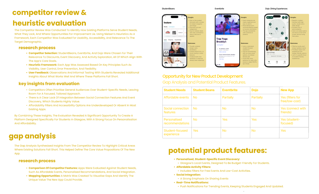
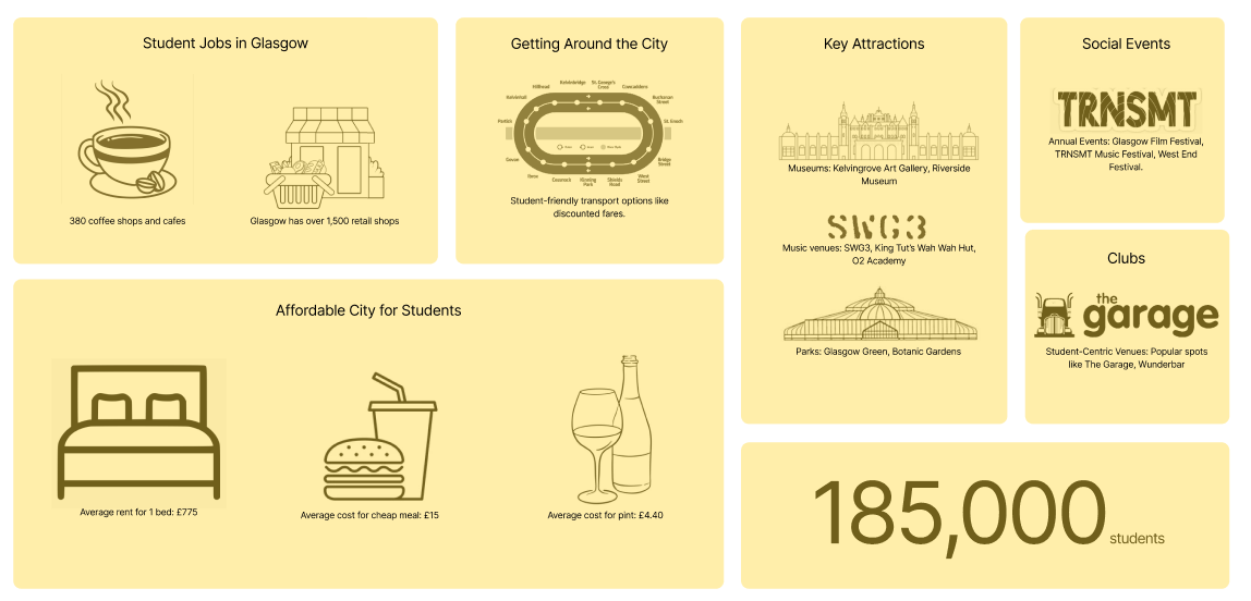
I conducted location-based research and a SWOT analysis to understand Glasgow’s unique position as a student city. With over 185,000 students, 380+ cafés, iconic music venues like SWG3 and King Tut’s, and major annual events such as TRNSMT and the West End Festival, Glasgow offers an incredibly vibrant cultural landscape. However, many students, especially newcomers, struggle to access or navigate this wealth of opportunities.
To explore Glasgow’s potential as a student engagement platform, I analysed local infrastructure, cost of living, transport access, and cultural assets. This revealed strong foundations for an app that could bridge the gap between students and the city’s offerings.
Define — Turning Insight into Opportunity
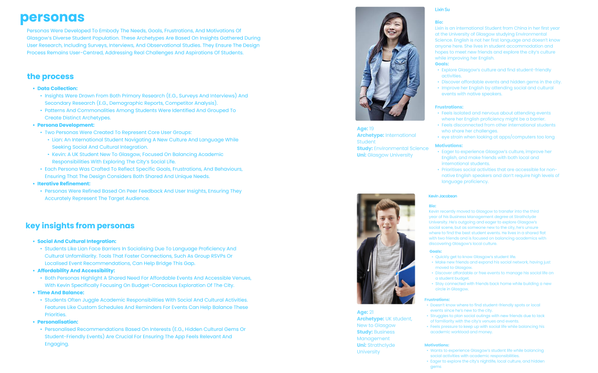
Using the findings from the Discover phase, I developed two detailed personas: Lian, an international student eager to connect socially but facing language and cultural barriers, and Kevin, a UK student balancing coursework with a desire to explore Glasgow affordably.
I also mapped their journeys and wrote job stories to ground each feature idea in real-life student scenarios. This helped generate actionable “How Might We” questions that guided the design scope like “How might we help students feel more confident attending events alone?” or “How might we highlight low-cost, local activities?”
Develop — Exploring and Structuring the Experience
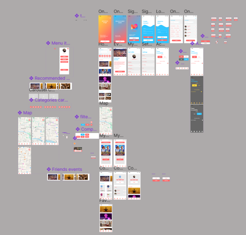
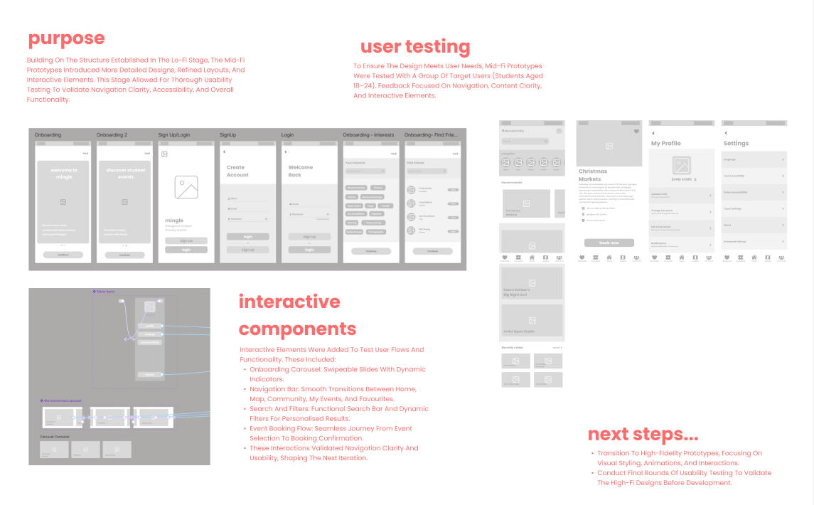
Building on low-fidelity wireframes and user flows, I transitioned into mid-fidelity prototyping to focus on interaction, layout clarity, and structural consistency. This stage allowed for more realistic testing of navigation patterns, event browsing, and booking flows without the distraction of final visuals.
From there, I began defining a scalable component system within Figma to ensure consistency across the app. I created reusable elements for:
Event cards (home, explore, favourites)
Navigation tabs and sticky headers
Filter chips and buttons with accessibility in mind
Community feed tiles and RSVP interactions
Alongside the functional layout, I developed a style tile to set the app’s visual identity. Mingle’s tone is youthful, social, and inclusive, expressed through bold accent colours (like coral and navy), rounded buttons, friendly iconography, and clear, accessible Poppins typography.
This foundation paved the way for a high-fidelity design system that feels cohesive, energetic, and authentic to the student experience in Glasgow.
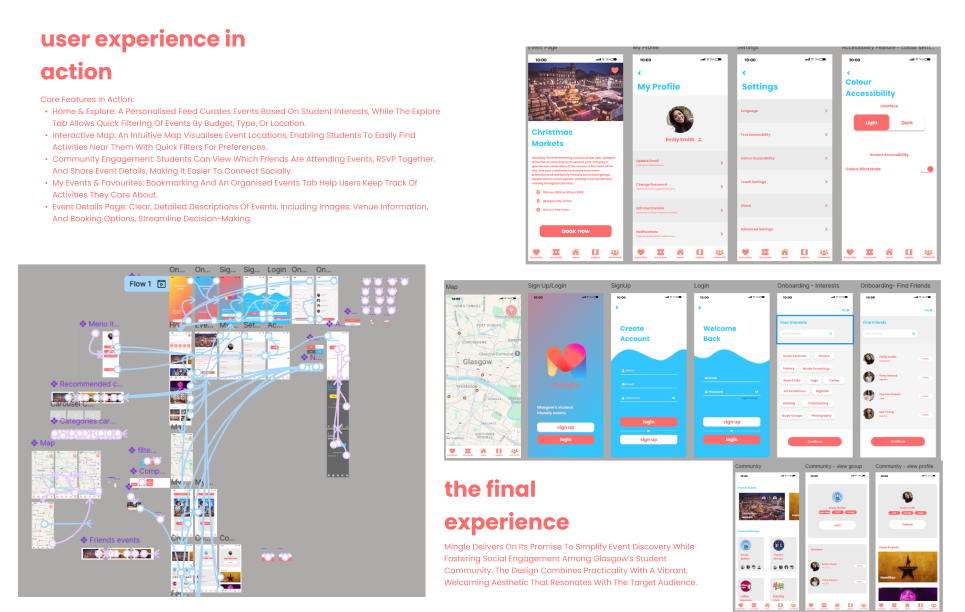
Deliver — Designing, Testing, and Refining Mingle
In the final phase, I translated the mid-fidelity structure into a high-fidelity interactive prototype using Figma, applying the full UI system developed during the previous stage. This included branded typography, accessible colour contrasts, refined iconography, and consistent spacing to ensure visual harmony and usability.
Key screens such as the Home feed, Explore map, Event Details, and Community tab were designed to feel dynamic, intuitive, and welcoming, with microinteractions and motion used sparingly to add delight without distraction.
The prototype was tested with students from diverse backgrounds to validate:
Navigation clarity
Tap target sizes on mobile
Content hierarchy and scannability
Accessibility preferences, including colour contrast and spacing
Based on feedback, I made several final refinements:
Increased white space around event cards to reduce cognitive load
Enlarged tap targets in the nav bar and filter buttons
Streamlined filter interaction on the map by introducing a quick-access menu
Improved text hierarchy and contrast for users with visual impairments
The result is a high-fidelity design that’s both functional and emotionally engaging, delivering a seamless, student-first experience that empowers users to explore Glasgow with confidence and connection.
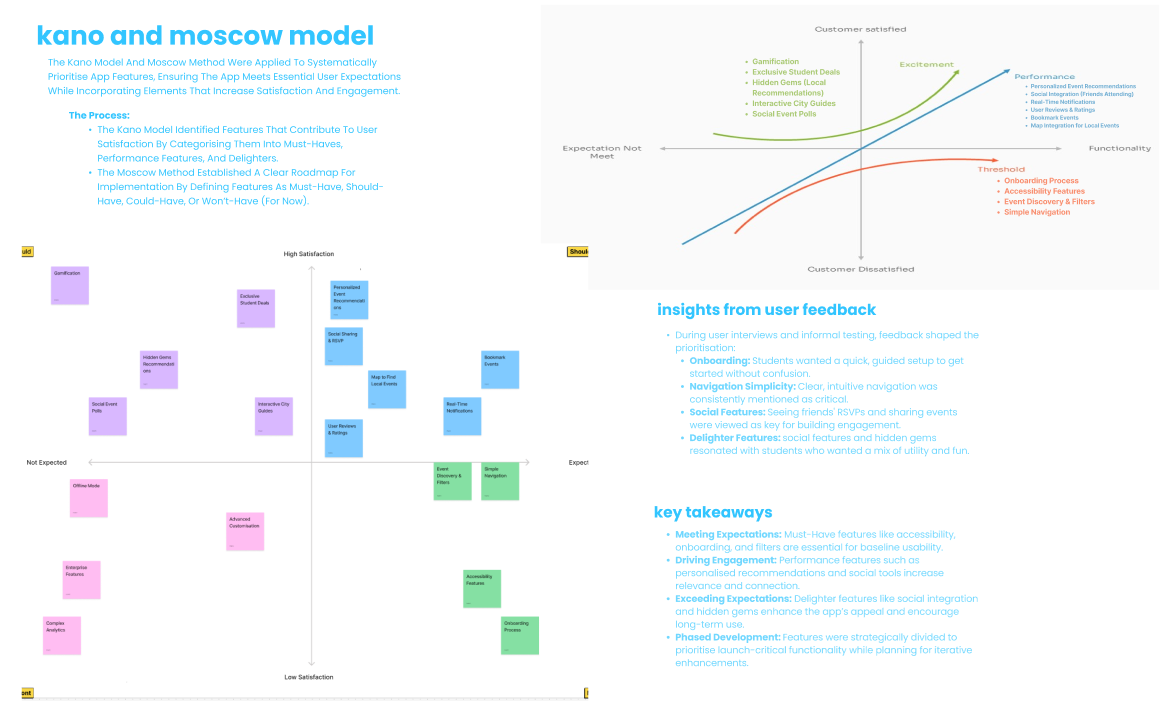
To ensure the app delivered meaningful value without feature bloat, I used the Kano Model and MoSCoW method to prioritise functionality based on user needs and emotional impact.
The Kano Model helped distinguish between basic expectations (like clear navigation), performance features (such as budget filters and interactive maps), and delighters (like seeing which friends are attending events). This framework was instrumental in shaping features that not only met students’ functional needs, but also created moments of surprise and delight, essential for engagement.
In parallel, the MoSCoW method clarified which features were Must-Have (e.g., event discovery, RSVP, accessibility settings), Should-Have (e.g., personalised feeds, interactive map filters), Could-Have (e.g., community content, badges), and Won’t-Have for now (e.g., third-party ticket integration). This ensured we stayed focused during prototyping, without overextending the initial MVP scope.
Together, these tools provided a structured yet flexible way to make confident, evidence-based decisions about what belonged in the app, and what could wait.